Methinks we have a new contender for the title of "Most Photoshop Effects", which is currently held by
"Fishes of Georgia". And, as Thom Yorke might say, those are some weird fishes.
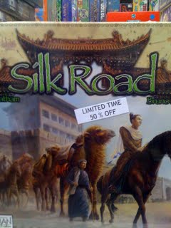
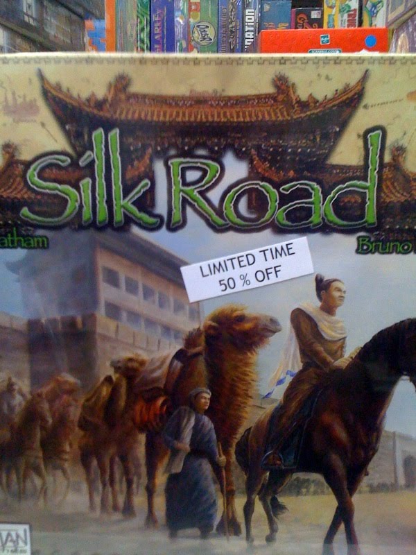
But here we have a new submission, found in "The Compleat Strategist" gamestore in New York. I think if you added another Photoshop effect to the title block of Silk Road, that might just be the straw that broke the camel's back. Get it? Camel!?
Let's do a head-to-head matchup of photoshop effects, Fishes of Georgia (FoG) vs. Silk Road (SR)


Inner Bevel: SR has a nice inner bevel going on here, but FoG has it cranked to the max.
Winner: Fishes of Georgia
Outer Glow: They're both about the same, but the outer glow on FoG seems a little bit softer. The hard edge of the glow on SR looks intense.
Winner: Silk Road
Drop Shadow: FoG has a solid drop shadow, with nice distance, making it feel like the text is floating above the fish, or perhaps swimming by it. However, what the drop shadow on SR lacks in distance, it makes up for in blur and intensity. That thing is X-treme.
Winner: Silk Road
There it is ladeez and hipsters, the new winner of "Most Photoshop Effects" is...
SILK ROAD!
Thanks for the submission!
Overall rating: A (For Asian-European Trade Routes)


 Stumble It!